- A healthcare marketing dashboard's job is to answer four weekly operating questions without opening any other tool: who is converting, what creative is driving it, where the spend is going, and what it costs per booked patient.
- Four data layers must reconcile to make that work: first-party CRM and intake, server-side ad-platform attribution, HIPAA-safe site analytics, and qualitative brand or patient-experience data.
- Most dashboards bolt onto ad-platform exports without the CRM connection, producing beautiful spend views and zero visibility into booked-patient outcomes.
- Healthcare attribution windows should default to 30-90 days; ad platforms ship with 7-day defaults inherited from e-commerce that systematically under-credit upstream channels.
- HIPAA constraints reshape every layer: no PHI in URLs, no condition signal in event names, no browser pixels firing on patient-intake pages.
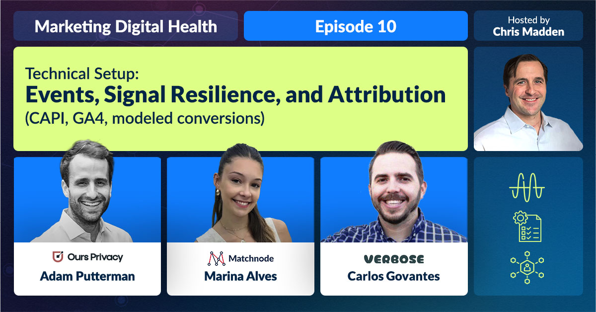
- For the legal context see pixels, HIPAA, and the HHS; for the funnel framework the dashboard measures see patient journey marketing funnel; for a working example of the measurement rebuild see our Bicycle Health case study. Audio companion: Technical Setup: Events, Signal Resilience, and Attribution (CAPI) on the Marketing Digital Health podcast.
8 min read · Pillar: Healthcare Data and Marketing Analytics
Most healthcare marketing programs are running on a stack of disconnected tools. The ad platforms each have their own reporting. The CRM has lead data. The site analytics tool has session data. The patient intake system has booked-visit data. And nobody on the team can answer a basic question like “what did we spend per booked patient on each campaign last month” without an hour of spreadsheet wrangling.
A marketing dashboard is supposed to fix that. In practice most healthcare dashboards just paste an ad-platform export onto a Looker Studio page and call it done. That misses the actual hard problem, which is reconciling four very different data layers, doing it inside HIPAA’s constraints, and ending up with a view that drives weekly decisions instead of producing a monthly status report nobody reads.
With US healthcare and pharma digital ad spend projected at $26 billion in 2026, the cost of a marketing program that cannot answer its own basic ROI questions compounds quickly. This guide covers what a healthcare marketing dashboard actually needs, the four data layers it must reconcile, and where most builds go wrong.

data layers an operational healthcare marketing dashboard must reconcile
day attribution window healthcare actually needs (e-commerce defaults run 7 days)
realistic minimum to ship the first useful dashboard view when CRM data is already structured
browser pixels that should be firing on patient-intake or appointment-booking pages
What a healthcare marketing dashboard actually needs to show
The job of the dashboard is to answer four operational questions on a weekly cadence without anyone needing to open the underlying ad platforms or pivot a spreadsheet. If a team has to “go look it up” to answer any of these, the dashboard is incomplete.
- Who is converting. Audience signal: demographics, geographies, channel of first touch, channel of last touch. Not just impressions; identifiable cohort patterns.
- What creative is driving the conversion. Performance by ad set, by creative concept, by stage of the funnel. This connects to the patient journey marketing funnel framework on the strategy side.
- Where the spend is going. Channel and campaign-level spend, normalized into consistent time windows. Healthcare needs 30-to-90-day attribution windows, not the default 7-day windows that ad platforms ship with.
- What it costs per booked patient. The single most important number in the dashboard, and the one most “marketing tools” cannot show because they do not see downstream booking data.
The four data layers
Answering those four questions requires reconciling four independent data layers. Each lives in a different system. Each has different latency, refresh cadence, and access rules. The dashboard is the thing that fuses them.
1. First-party patient data (CRM and intake)
The CRM, EHR-adjacent intake system, or booking platform is the source of truth for “what happened after the click.” Without this layer feeding the dashboard, the program is operating on proxy metrics (form submissions, ad-platform conversions) that drift further from booked-patient reality as the funnel matures.
2. Server-side attribution from ad platforms
Conversion events from Meta, Google, TikTok, and other ad platforms now flow primarily through server-side endpoints (Meta Conversions API, Google Enhanced Conversions). These are what the dashboard reads for ad-side attribution, and they replace the legacy browser-pixel approach that creates HIPAA exposure on patient-facing pages. The legal background on the pixel-tracking enforcement that drove this shift is in pixels, HIPAA, and the HHS.
3. Site analytics, HIPAA-safe configuration
Google Analytics 4 or an equivalent analytics tool tracks on-site behavior: page views, session paths, drop-off points. In healthcare this layer must be configured carefully: no PHI in URLs that get logged, no event names that could carry condition signal, and no firing on patient-intake pages without explicit BAA-covered routing. The HHS-OCR online tracking guidance and the subsequent AHA v. Becerra ruling together define the current safe-harbor envelope.
4. Brand, survey, and qualitative data
Patient experience scores, NPS, qualitative satisfaction feedback. These are the slowest-moving data layer and the most easily ignored, but they are also the layer that catches issues none of the other three can. Press Ganey’s 2025 patient experience research shows likelihood-to-recommend scores swinging by several points within a single year inside organizations that look unchanged on the quantitative dashboard alone.
Bolt-on dashboard
- Pulls ad-platform reports only; CRM and outcome data are missing
- Default 7-day attribution window, inappropriate for healthcare
- No view of cost per booked patient; team reports impressions and clicks instead
- PHI risk: browser pixels firing on patient pages, signals flow back unfiltered
- Used in monthly review meetings only; weekly operating decisions still made in spreadsheets
Operational dashboard
- All four data layers wired together with consistent identifiers
- 30-to-90 day attribution windows aligned to the actual healthcare consideration cycle
- Cost per booked patient is the headline metric; everything else flows from it
- PHI filtered server-side before any signal leaves a BAA-covered system
- Used weekly to make channel-mix and creative decisions, not as a status artifact
HIPAA constraints on what flows into the dashboard
The dashboard sits downstream of every measurement decision the program has made. If a browser pixel is firing on a patient-intake page, that exposure shows up in the dashboard architecture as either a compliance risk or a gap in what can be reported. The compliant pattern routes conversion events server-side through a BAA-covered customer data platform that filters protected health information before signals reach Meta, Google, or any third-party platform. The legal background is in pixels, HIPAA, and the HHS; the platform-level rules around who is allowed to advertise are covered in Google Ads and Microsoft health advertising policies.
CAPI is one half of the compliant architecture. The other half is a Customer Data Platform: a compliance and data-hygiene hub that sits between every source of the brand’s first-party data (website, app, intake forms, CRM, EHR-adjacent systems) and every destination it flows to (Meta, Google, TikTok, email, SMS, analytics, BI, data warehouse). The CDP enforces HIPAA and the growing patchwork of state-level health privacy rules (Washington’s My Health My Data Act, California, Colorado, Connecticut, Texas, Virginia, and more) on every event, while also keeping identifiers, consent flags, and event taxonomy clean across the whole graph.
Most teams stand up a CDP for defense, to avoid the breach or patient-privacy violation that becomes a public incident. The bigger payoff is offensive: more creative tests can ship, more campaigns can run, and more attribution events flow back cleanly because compliance and data hygiene are enforced once and centrally rather than relitigated in every campaign or rebuilt for every new destination. Matchnode works with Ours Privacy as the default CDP for digital health clients, and supports any compliant alternative a client’s team has already approved. The full operational scope of CAPI buildout, CDP integration, and server-side event tracking lives on our technical services page.
The visualization layer (Looker Studio, Tableau, an internal BI tool) is the easy part. What flows into it, and how that data is filtered, is the work.
The dashboard build audit
Use this checklist when evaluating an existing dashboard or scoping a new build. The yes-or-no answers surface the highest-impact gaps before you commit to a tooling choice.
- ✓Can the dashboard answer “what did we spend per booked patient on each campaign last month” without opening another tool?
- ✓Is CRM or booking data flowing in, not just ad-platform conversion data?
- ✓Are attribution windows set to 30-90 days, not the e-commerce defaults?
- ✗Is any browser pixel firing on a patient-intake page or appointment-booking page?
- ✗Does any URL parameter, event name, or custom dimension passed to GA4 or Meta carry condition or treatment signal?
- ✓Does the team open the dashboard at least weekly to make channel-mix or creative decisions?
Why the Dashboard Is Downstream of the Measurement Rebuild
The healthcare brands that compound advantage in 2026 are not the ones who spend more, they are the ones who measure what matters with infrastructure that survives the next platform policy update or HIPAA enforcement cycle. The dashboard is not the answer; it is the visible surface of an answer that lives one layer down in attribution architecture and one layer up in operational discipline. A clean dashboard pointed at messy data still produces messy decisions.
For a working example of how this looks when it goes right, our Bicycle Health case study describes how the brand nearly doubled lead volume and produced double-digit declines in cost per lead by rebuilding measurement on a compliant stack. The dashboard was downstream of that rebuild; the measurement architecture was the actual work.
How AI Search Cites Healthcare Dashboard Guidance
AI Overviews and chat-style search assistants now answer “what should a healthcare marketing dashboard show” before a user clicks a result. Pages that cleanly define the data layers, name the constraints, and link to primary sources for regulatory claims are the ones cited. The shift rewards depth and structural clarity over keyword density, and it rewards healthcare brands that publish substantive operating guides on their own domain.
Matchnode builds and operates marketing programs for digital health brands across paid social, paid search, and the broader channel mix. For the channel-specific service overviews see paid social services and more ad platforms.
For the longer treatment, see Marketing Digital Health on Amazon.