By Howie Zisser
The migration to mobile is almost complete and building mobile landing pages that converts is more important than ever.
However, the emphasis on mobile landing pages that convert is not where it should be.
Most people still design their landing pages with desktop in mind and then adapt it to a mobile screen later, almost as an afterthought. It should actually be the reverse.
It’s the worst kept secret that the limitless amount of information available to us has resulted in an ever decreasing attention span – no wonder Finding Dory was such a hit this year.

So in this busy mobile world we live in, we have to be sure that we fully optimize each and every step of the customer’s journey. Don’t make them work any harder than they have to!
That also means that building mobile landing pages that convert isn’t as simple as taking your regular, desktop landing page and shrinking it to fit a smaller screen.
You should be optimizing for mobile landing page conversion optimization – and that often means it needs to be different than the desktop version. Luckily there are mobile landing page templates that you can start with if need be.
The mobile space is more competitive so you need to be firing on all cylinders to keep your customer’s attention and to get them across the finish line with a smile.

The Importance of Mobile Landing Pages that Convert
According to this report from comScore, 65% of all digital media time is spent on mobile devices. And back in 2014, the number of mobile users officially passed desktop users. A trend that is not going away.
Take a look around any bus commute and you’ll see virtually everyone’s face buried in their phone. That’s because 80% of internet users own a smartphone, according to this Smart Insights report.
So unless you’re like Andrew Luck and haven’t embraced the smartphone quite yet, you better have a mobile landing page that converts. Like Luck, mobile marketing is just different.

Search
What are all these people doing on their smartphones? Well aside from sending their friends Snapchats, it turns out they’re doing a lot of searching – hopefully for your product!
According to Hosting Facts, 48% of mobile users begin their search on a search engine. From there, they’re clicking what’s most relevant to them and usually (hopefully) finding themselves on a landing page.
These searches are being done anywhere…the train, work desk, in a store, the toilet, literally anywhere. All of those places are pretty distracting, so any hiccup in their mobile experience will send them bouncing from your page.
Browser Behavior
Consider how your own behavior differs when you’re on your desktop versus your smartphone.
On desktop, you likely browse passively. Clicking from article to article, satiating your curiosity as you go. Click bait is popular for a reason, after all…
On the other hand, your mobile device oftentimes serves a more specific intention you have in mind, like ‘why does hot food smell more than cold food?’ (that can’t just be me)
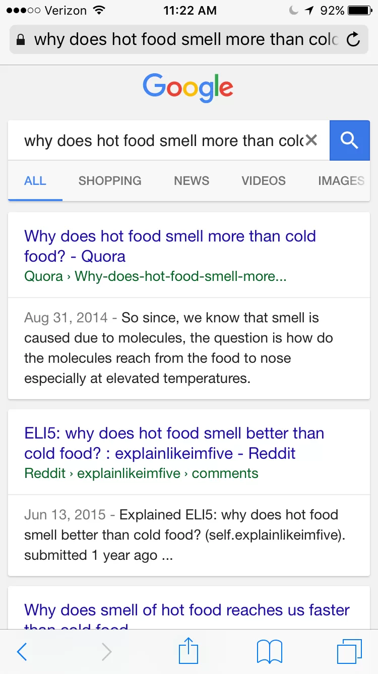
Bottom line, phone screens aren’t as easy to navigate so the user usually has an end goal in mind. It might be where to eat lunch or it might be where to buy their next purse.
And if they wind up on mobile landing page not optimized for conversion, there’s a 71% chance they immediately bounce.
Converting On Your Landing Page
Once a visitor clicks through to your landing page, you need to capture their attention ASAP otherwise they’re back to the abyss.
Don’t use any more words than necessary and keep it compelling so they keep scrolling.
It’s also nice to give them some subtle hand holding and guide them down the page.
Mobile Landing Page Calls-To-Action
There should be one obvious goal of any page in your conversion process.
This could be in the form of CTA buttons spread throughout the page to give your customer the option of converting at any time, or just to give them a heads up of what your ask will be upon completion.
The best converting mobile landing pages place the first Call To Action button above the fold of the page so that the visitor can opt to convert immediately if they’ve already made their choice.
Additionally there should be more buttons throughout the page so that whenever the visitor feels they have enough information, they always have a button in their view to click and take the next step.
Click-To-Call Mobile Landing Page Conversions
Depending on your type of business, some visitors will find it easier to just call you. I know that sounds old school in today’s digital age, but it really is true!
Oftentimes it’s just easier to talk to a real person to get questions answered – even simple ones like booking an appointment, store hours, or pricing.
According to eConsultancy, 52% of mobile searches find click-to-call buttons useful in their purchase decisions.
Another reason to include a click-to-call option is that those who are making a call are more likely to be further along in their purchasing decision, making them all the more likely to convert after speaking with your company.
Mobile Landing Page Personalization
Landing pages are also a chance to personalize your user’s experience. You can create separate landing pages for traffic from different channels like organic search, social, or email, and welcome your users accordingly. HubSpot nails this:
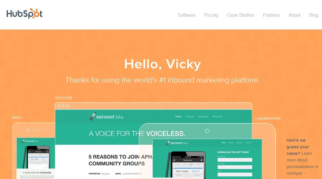
Check out this guide on mobile landing page conversion best practices for more in-depth information.
Before They Leave!
You brought people to your mobile landing page for a specific purpose, be it to sign up for a list, download an ebook, or make a purchase.
Make this process simple, so keep your form as short as possible. Any information you can live without, leave off the form submission. It’s easier to ask for a little more later once you have some buy-in.
Also keep in mind where the user is likely to be in the purchasing decision. Asking for an email is a small ask for someone relatively new to your company, whereas asking for a purchase is a bigger ask and could scare off a person doing some casual browsing earlier in the purchase cycle.
These forms need to be created with a mobile screen in mind. This isn’t a desktop where it’s easy to scroll around and click on any link; some people’s fingers simply weren’t built to manipulate small fields on a screen. Don’t compound the issue by having lots of little fields to fill out right next to each other.

If you want to get really fancy, you can even create separate landing pages for traffic from different channels like organic search, social, or email.
This is a great guide from Annielytics on how to get the most out of your Channels Report in Google Analytics.
Mobile Landing Page Conversion Goals
As with most things in conversion rate optimization, there is no one standard to shoot for. It varies from product to product, and industry to industry.
But there are some landing page conversion rate benchmarks to be aware of to mark your progress.
Typically, the landing page conversion rate average is between 2-5%. That’s across all industries, so your market may be significantly higher than this or even a tad lower.
For example, the landing page conversion rate statistics show that the median for eCommerce sites is 1.84%. This might be due to how crowded the space is and the diversity of options.
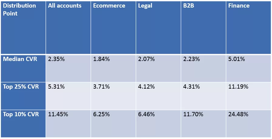
Other factors that can influence your conversion rates are price and urgency. The higher the price, the more you need to build that relationship of trust. Likewise, a less urgent need is likely to take longer to convert. If you need pest control, you’re likely to convert right away!
Closing Thoughts on Mobile Landing Pages that Convert
Mobile traffic officially reigns supreme in the web traffic kingdom and that trend isn’t reversing anytime soon.
Due to the high level of distractions available on mobile, users make their decision about you in a split second. Make sure you win them over.
To stay ahead of the curve, think like a mobile user and design your landing page with them in mind first.
If you’re looking for a great tool to learn some mobile landing page conversion tips, we love using Unbounce – it’s an easy to use and highly customizable mobile landing page builder.
Happy converting!


