by Alecia Wright
Do you remember your life before your smartphone? That was a mere 8 years ago, yet the focus of our lives has drastically shifted, and our iPhones and Androids are at the epicenter.
Reports vary, but we spend 3 – 4 hours on our smartphones daily. According to Forrester, there are 30 billion mobile marketing moments (opportunities for marketers to engage and win over consumers) in the US each day. So, how do marketers use these moments to not only reach users but also optimize their mobile experience?
Let’s take a look at some mobile landing pages best practices.
Mobile Web vs. Mobile App
It is important to differentiate between mobile web browsers and mobile apps. Mobile responsive landing pages live on mobile web browsers. According to Entrepreneur, “the same set of customers that access your business through a desktop could potentially connect with your brand on-the-go through their smartphones.”
Mobile apps, on the other hand, are separate entities that are best suited to brand loyalists who are willing to download and use your app. It depends on your audience and their level of engagement.
What is Mobile Responsiveness?
Mobile responsiveness refers to a responsive website that automatically adjusts to fit your device. Depending on the screen from which you are viewing a website (iPhone, Android, iPad, desktop), the content layout should adapt. A mobile experience is not optimized unless the website fits your screen!
Mobile Maturity
In this mobile age, it is surprising that 44% of companies still use the antiquated “Shrink and Squeeze” technique that shrinks pages optimized for desktops onto a small mobile screen. As expected, the experience does not translate well between these interfaces, and customers are more likely to click out of poorly designed web pages.
42% of businesses focus on “Mobile-First” as the primary method of enhancing the mobile experience, with options such as geo-location easing the option of finding retail stores nearby.
The biggest areas of opportunity for mobile include “Customer Experience (CX) Transformation,” with only 4% of businesses focusing on addressing and alleviating customer’s pain points. Lastly, less than 1% of businesses disrupt industries, such as Uber revolutionizing the sharing-economy model and disrupting taxi services worldwide.
How to Market Mobile Landing Pages
The above percentages show that companies need to continually evolve their approach to mobile. It is no longer sufficient for businesses to claim “mobile as a strategy” because everyone is following suit. Rather, businesses need a strategy for their customer’s mobile experience, understanding where it fits in their customers’ lives and decisions. This is where mobile landing pages that convert come into play.
What is a Mobile Landing Page?
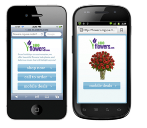
A mobile landing page is the web page that “responds” by changing its design to suit a mobile screen when displayed on a mobile web browser.
Sometimes a page that looks perfect on a desktop looks distorted on a mobile screen. What are mobile mistakes to fix?
Mobile Landing Page Best Practices
1. Optimize for Mobile
- Test landing pages on multiple devices before launching a site on mobile
- Mobiletest.me allows you to see how your website looks on various mobile devices

2. Simplicity Rules
- Have a concise, easy to read headline
- Keep design and text style minimal
- Use simple images
3. Reduce Text
- Mobile users tend to be on-the-go and don’t want to scroll through pages of text
- Mobile users are forced to read linearly
- Be concise
4. Give Customers What they are Looking For
- Put this information at the top to reduce the likeliness of clicking out
5. A/B Test Layouts
Which layout do customers react better to?
6. Test Form Fields on Lead Gen Forms
- Too many forms = opportunities to click out
- Reduce form fields for more conversions
- More form fields = higher quality leads
7. Have Clear Calls to Action
- If you want people to subscribe to your newsletter, have a form field on top
- Too many calls to action convolute the message
- As marketing guru Oli Gardner says, “One Page. One Purpose. Period.”

Mobile pages can also have “sticky footers” or “parachute buttons,” which stick to the bottom of the page as you scroll down. Click here for an example of a call button in the sticky footer. Buttons with a call to action such as “click to call” easily drive phone call conversions from your mobile phone.

Sticky Footers: Driving Phone Calls on Mobile Devices
Depending on the service your company provides, phone calls can be more valuable conversions than filling in generic forms. On a mobile landing page, adding a “click to call” button as a sticky footer gives customers the opportunity to call at any time in their mobile landing page scroll because the option will always be visible. This is invaluable for not losing potential leads.
Best Landing Page Template: Unbounce
Unbounce touts itself as “The Mobile Responsive Landing Page Builder for Marketers.” It takes the guesswork out of building a landing page, offering robust features like 200+ templates, drag-and-drop capabilities, and A/B testing.

Matchnode Case Study: New Balance
At Matchnode, we love Unbounce. For a campaign for our client New Balance Chicago, last year we used Unbounce’s mobile landing pages to capture email address conversions. By delivering promotion codes via email to be used exclusively in stores, New Balance Chicago’s brick-and-mortar stores saw a 200% increase in sales, all thanks to a well planned mobile landing page.

Bottom Line
Landing pages are useful marketing tools. When implemented carefully and effectively, they can greatly increase the quantity and quality of conversions.
Resources:
http://blogs.forrester.com/thomas_husson/15-04-16-mobile_first_will_not_be_enough
http://www.entrepreneur.com/article/235981
http://conversionsciences.com/blog/marketing-power-processes-the-lord-of-the-rings/
https://www.quicksprout.com/2014/02/24/how-reducing-options-can-increase-your-conversions/
http://conversionsciences.com/blog/marketing-power-processes-the-lord-of-the-rings/
http://unbounce.com/conversion-rate-optimization/psychology-of-choice-conversion-rates/


